Customers can now access an unprecedented amount of information thanks to the internet. And their ability to instantly research and compare brands means they’re unlikely to purchase from those they don’t recognize or trust. This is because the mere exposure effect—a powerful psychological bias—naturally inclines customers to favor brands they’re already familiar with. This makes having solid brand guidelines in place a must.
The good news is that you have the power to influence brand recall and consequent sales with consistent communications powered by a brand style guide.
Well-crafted brand guidelines clearly outline your brand identity and visual components, guiding all departments and employees in communicating on behalf of your company.
While branding style guides don’t follow a one-size-fits-all approach, some must-have components must be included to keep your brand cohesive, no matter who creates the content.
That being said, let’s dive in and discover the basics of creating a practical brand style guide, with brand style guide examples sprinkled throughout for direction and inspiration.
Table of contents
- What is a brand style guide?
- Why do you need a brand style guide?
- Preparations for your branding style guide
- What should you include in your brand style guide?
What is a brand style guide?
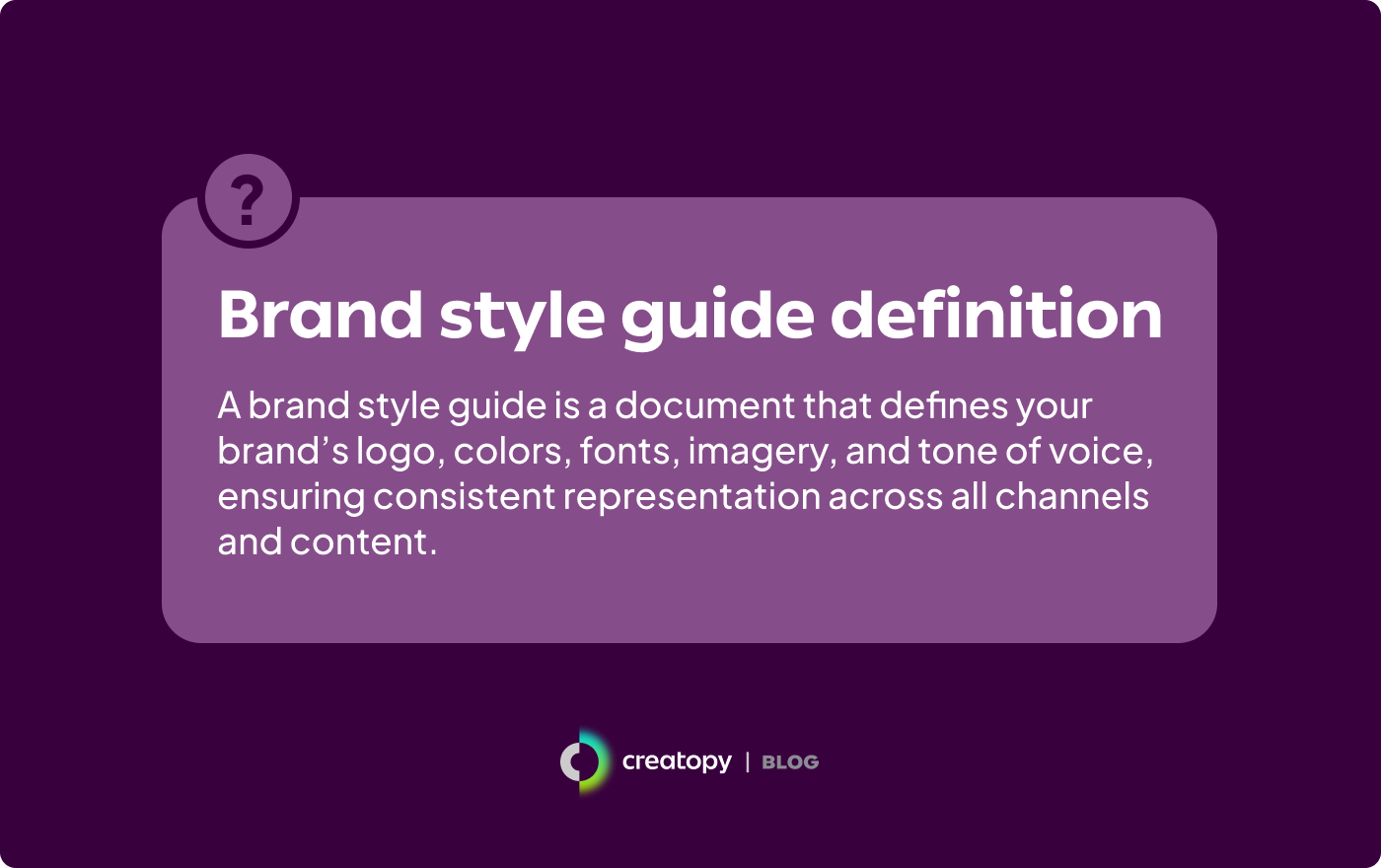
A brand style guide is a document that dictates how you represent your brand, both visually and verbally, across all content and communication channels. Typically outlined in a PDF, it explains key brand elements such as your logo, color palette, typography, and tone of voice. It also includes practical, actionable tips that dictate how content creators should apply these elements to their creations.
Why do you need a brand style guide?
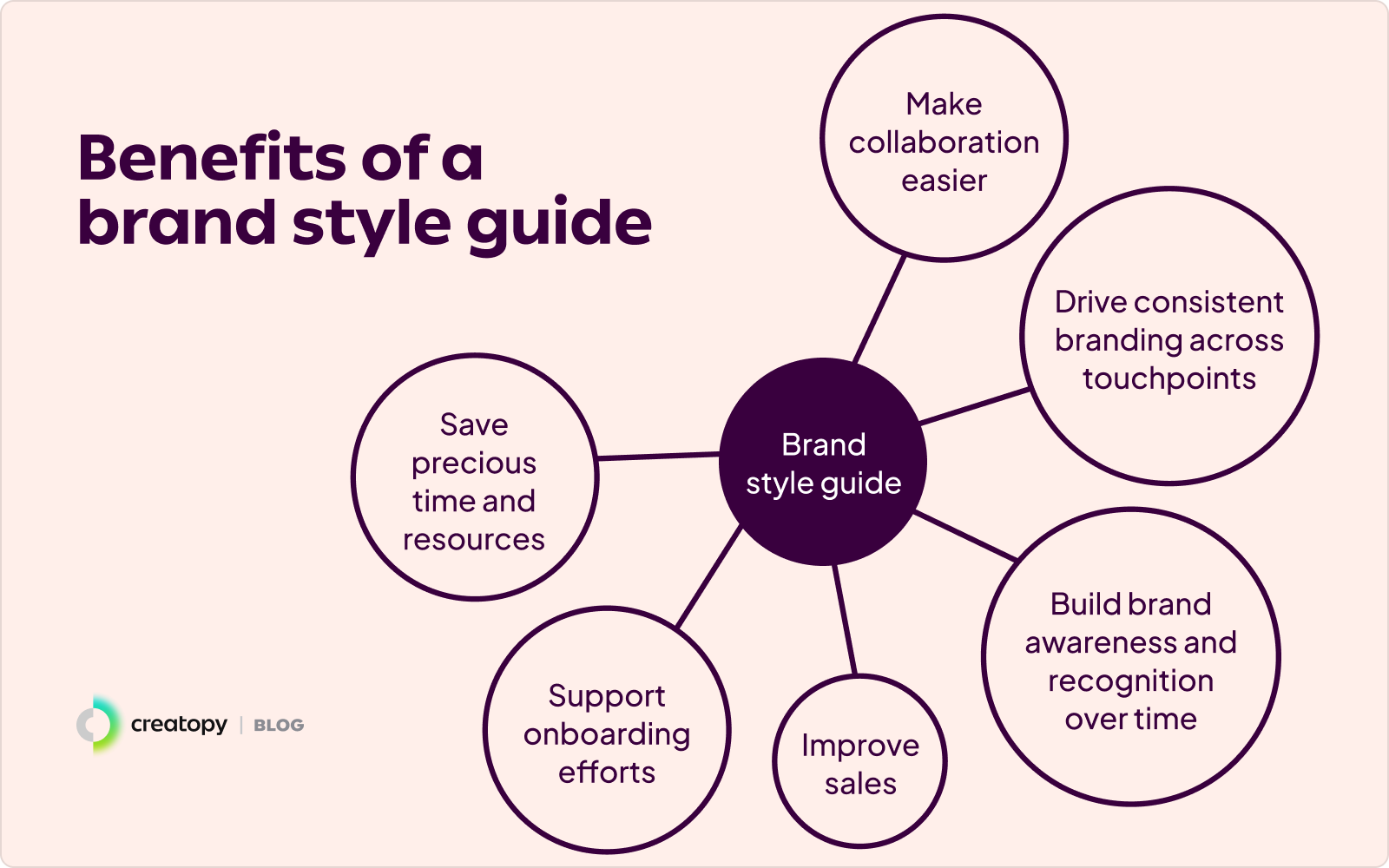
The benefits of having a brand style guide aren’t just external. Well-thought-out branding style guides can be highly advantageous internally as well, helping you:
- Drive consistent branding across touchpoints
- Build brand awareness and recognition over time
- Improve sales
- Support onboarding efforts
- Save precious time and resources
- Make collaboration easier
Drive consistent branding across touchpoints
If we ask you to think of two prominent brands, one of the first ones that likely come to mind is Coca-Cola. Why? Because of how carefully and meticulously they’ve curated and communicated their brand over time.
Just think back to all your Christmas holidays and you’ll likely recall one of Coca-Cola’s iconic Christmas adverts or slogans as being part of them. Their consistency in terms of brand personality, colors, and logo over decades means they’ve cemented the idea of who they are into consumers’ minds. This consistency can likely be attributed to their solid brand guidelines.
Build brand awareness and recognition over time
Studies found that consistent branding can increase brand recognition by up to 80%. If prospective customers keep encountering your brand’s cohesive marketing communications, which continuously evoke a clear message of who you are as a business and what you stand for, you increase the likelihood of them remembering your brand. Your visual identity—think brand colors, logos, and imagery—helps customers subconsciously pick up on these as patterns and associate them with your brand. Over time, this repeated exposure reinforces brand recognition and familiarity.
Improve sales
Piggybacking on the previous point, the familiarity built on consistent branding trickles over into trust, which is a key factor in purchasing decisions. In fact, the average estimated revenue increase attributed to consistent branding is 23%. If customers can instantly recognize your brand among competitors due to its precise, well-established guidelines, your brand stands out as reliable. Naturally, customers flock to brands that appear well-organized and steadfast in how they present themselves, as this sets the foundation for trustworthiness.
Support onboarding efforts
If you have a brand style guide in place, new employees can quickly gain a better understanding of your brand. Instead of spending hours walking new hires through your brand’s values, tone and voice, and visual identity, you can use your brand style guide as a one-stop resource. This will get new employees up to speed and give them the confidence to contribute to your marketing communications more confidently earlier on.
Make collaboration easier
A brand style guide also helps existing employees, making collaboration on branded communications much smoother. They can use the brand style guide as a reference when creating content, spending less time on back and forths discussing branded elements with colleagues. Additionally, having one source of truth for all things branded communications reduces the need for lengthy decision-making on the how, what, and why of applying branded components to marketing communications.
Now that we know the value of branding style guides, we can shift our focus from the why to the how.
Preparations for your branding style guide
Before we look at the individual components you need to include in your branding style guide, you need to check a couple of prerequisites. These include having to:
- Define or clarify your brand identity
- Research your competitors
- Source visual inspiration
- Consider your long-term brand evolution
Let’s hone in on these to see why they’re necessary.
Define or clarify your brand identity
For starters, consider how you want customers to perceive your brand and what position you’d like to hold in the market. Together, these define your brand identity, giving you a better idea of what look and feel you should aim for your brand.
You can briefly outline the basis of your brand identity by answering the following questions:
- What are your brand’s objectives? This emphasizes your brand’s short-term goals and can give you a better idea of your near-term action plan.
- What does your brand set out to do in the long run? This highlights your brand’s long-term aspirations and guides your cumulative efforts.
- What are the principles that guide your brand? This outlines your core beliefs and culture as a company.
- What differentiates you from your competitors? This brings to light the unique advantages that help your brand stand out.
- What would your brand sound like if it were a person? This determines the tone and personality of your brand.
- Who do you want your customers to be? This helps you identify the customers you should target with your messaging and offers.
Once you get a better grasp of your brand identity, it becomes much easier to translate it and weave it into your brand style guide.
Research your competitors
Knowing your competitors is just as important as knowing your own brand identity. You need to see what you’re up against before crafting your brand style guide to ensure you don’t get lost in a sea of sameness.
“If you know the enemy and know yourself, you need not fear the result of a hundred battles.”
– Sun Tzu, The Art of War
Take some time to research your competitors’ brand identities and communication styles. If available, review their brand guidelines to gain insights. These can inspire your approach and help you create a mental list of do’s and don’ts to guide the development of your business’s branding style guide.
Find visual inspiration
It’s one thing to think about your visual elements—it’s another to see how these actually work together. This is why we recommend creating a Pinterest board where you add images of the typographies, illustrations, photography, and other brand elements you had in mind. As you build it out, you can better visualize whether these clash with or complement each other.
What is included in a brand style guide?
Once your preparations are over and you have a better foundational understanding and mental image of your brand, you can cement it in your brand style guide.
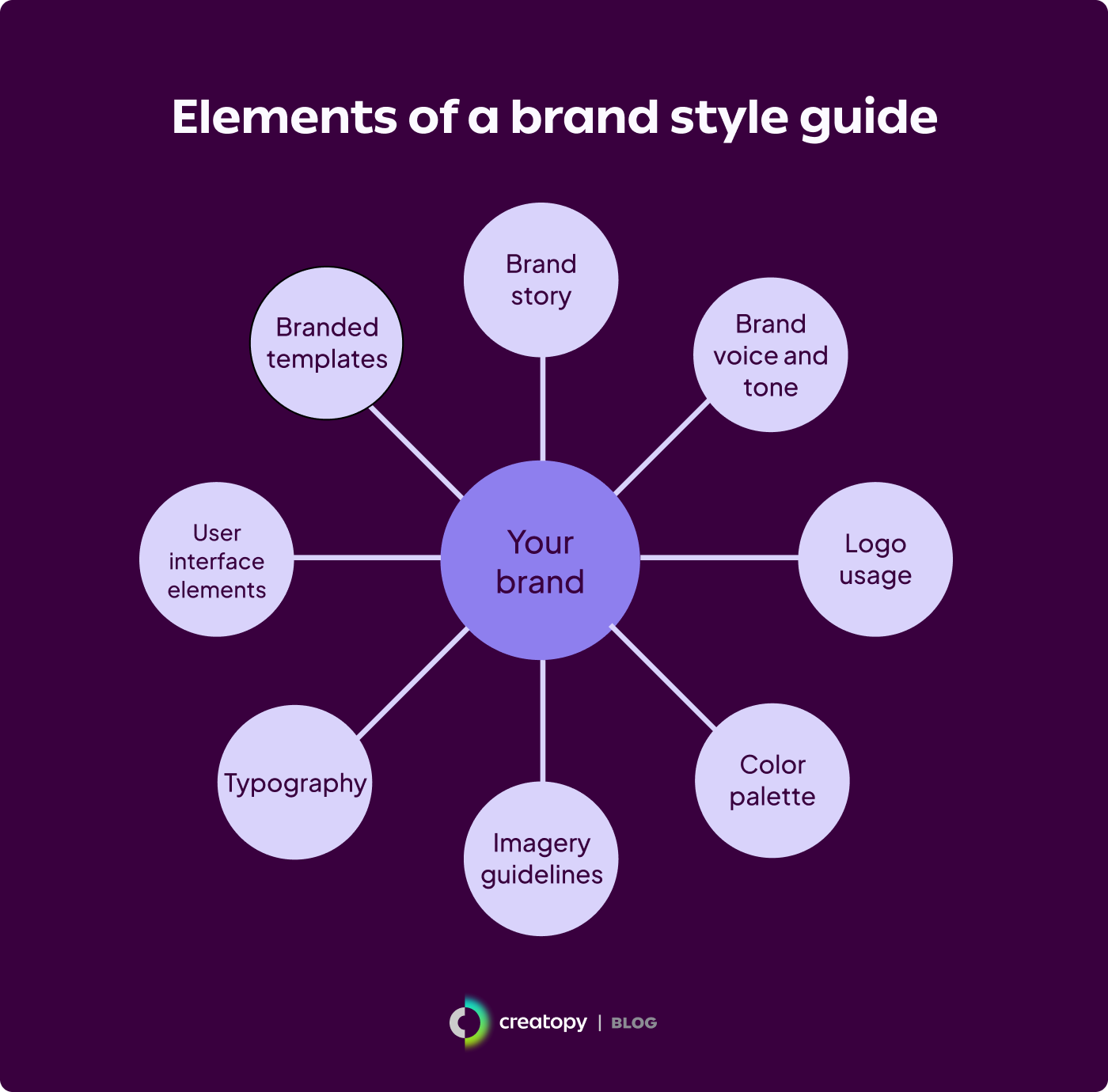
Your brand style guide should include, in the least, the following eight components:
- Brand story
- Brand voice and tone
- Logo usage
- Color palette
- Imagery guidelines
- Typography
- User interface elements
- Branded templates
1. Brand story
There’s nothing quite like a good story to reel people in, so engage your audience from the get-go with your brand’s very own story as an introduction. Make sure it conveys your brand’s vision, mission, and values, as these form the pillars of your brand.
These can be defined as:
- Brand vision: Where your brand aims to be in the future.
- Brand mission: What your brand currently does to achieve its vision in terms of the problems it solves or the value it provides.
- Brand values: What your brand stands for regarding the beliefs and principles driving its operations and interactions with the market.
Real-world brand style guide example: LinkedIn
Let’s move from theory to practice and see how LinkedIn conveys its brand story by encapsulating it in its vision, mission, and values.
Mission
To connect the world’s professionals to make them more productive and successful.
Vision
Create economic opportunity for every member of the global workforce.
Values
- We put members first
- We trust and care about each other
- We are open, honest, and constructive
- We act as One LinkedIn
- We embody diversity, inclusion, and belonging
- We dream big, get things done, and know how to have fun
2. Brand voice and tone
Your brand style guide should also include the tone and voice you use as a brand across your communications. It unifies your voice across channels by ensuring that whoever’s communicating on behalf of your brand does so in a way that’s congruent with communications everywhere else—whether on social media, websites, or print materials.
As your brand tone and voice aren’t static and may shift depending on the type of communication, channel, or audience you’re communicating with, this section of your brand guidelines should be detailed, covering:
- Your brand personality
- Tone variations according to different contexts and audiences
- Writing style guidelines
- Do’s and dont’s
Your brand personality
Convey what makes your brand unique by defining the characteristics and traits that make you stand out. Think of 3-5 adjectives—such as confident, approachable, or witty—that describe your brand’s personality.
If you want to be more detailed on the degree of each trait, you can represent it on a spectrum to help visual learners understand the nuances of your personality.
For example, say you were to put the three abovementioned adjectives on a spectrum. These would fall between these extremes:
- Confident: Authority ↔ Humility
- Approachable: Formal ↔ Casual
- Witty: Playful ↔ Serious
These visual diagrams can help your teams understand precisely how your brand positions itself on each trait.
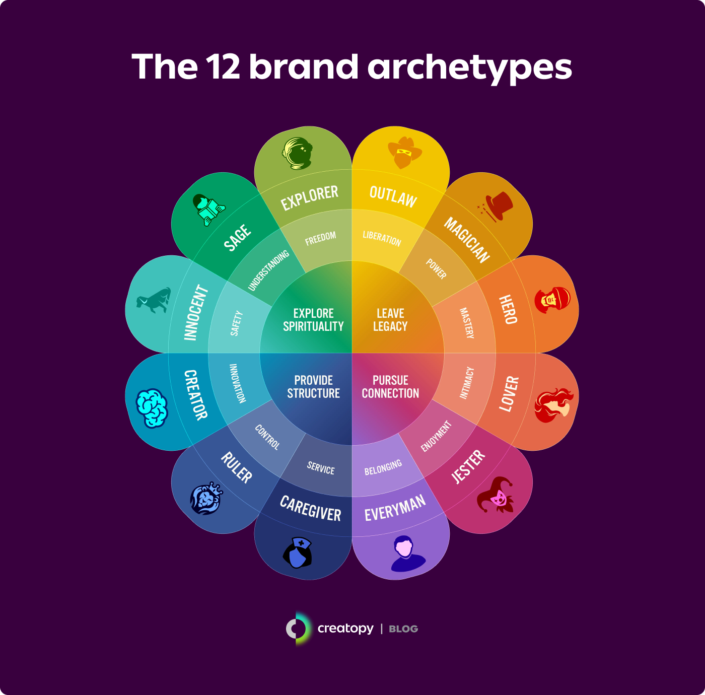
If you want to get granular, add more context to your brand’s personality by stating your brand archetype. Based on Carl Jung’s theory of universal archetypes, you can assign your brand one of twelve personality types—such as the Hero, Creator, or Jester—using your values, messaging, and how you connect with your audience as a compass. Choosing one humanizes your brand, providing a detailed breakdown of who you are to help guide internal and external branded content.
Tone variations according to different contexts and audiences
Sure, a consistent brand voice establishes your brand identity, but adaptability—the leeway to tweak it according to different circumstances—is what helps you connect with different target audiences. As part of your brand style guide, you should clearly describe specific situations where tone variations are necessary.
For example, if one of your brand’s traits is witty, you could specify how this wittiness would translate into different scenarios, such as:
- Customer support: Be friendly and empathetic with a touch of humor. Aim to diffuse tension without trivializing or downplaying customers’ issues.
- Marketing campaigns: Keep an engaging and playful demeanor to put a smile on customers’ faces while simultaneously driving the desired action.
- Press releases: Be motivational and lighthearted to keep morale and spirits high while building a fun workplace.
Writing brand style guidelines
This section should get in the weeds of your brand’s writing style. It should cover and specify how your brand goes about different aspects as part of its writing process, including:
- Style guide reference: Which external style guide your brand uses as a baseline, such as AP, Chicago, or Oxford.
- Grammar and punctuation elements: How your brand handles the Oxford comma, prefers active or passive voice, and uses contractions.
- Person usage: How and when your brand uses first, second, or third person in communications.
- Vocabulary and terminology: Which words and phrases your brand avoids, how you handle hyphenations, and which industry-specific terms to include.
Do’s and don’ts
Your brand guidelines also need a section highlighting do’s and don’ts that focus on bringing your brand’s tone and voice to life. This section should exemplify different applications of your brand’s tone and voice, adding a layer of practicality to the guidelines above.
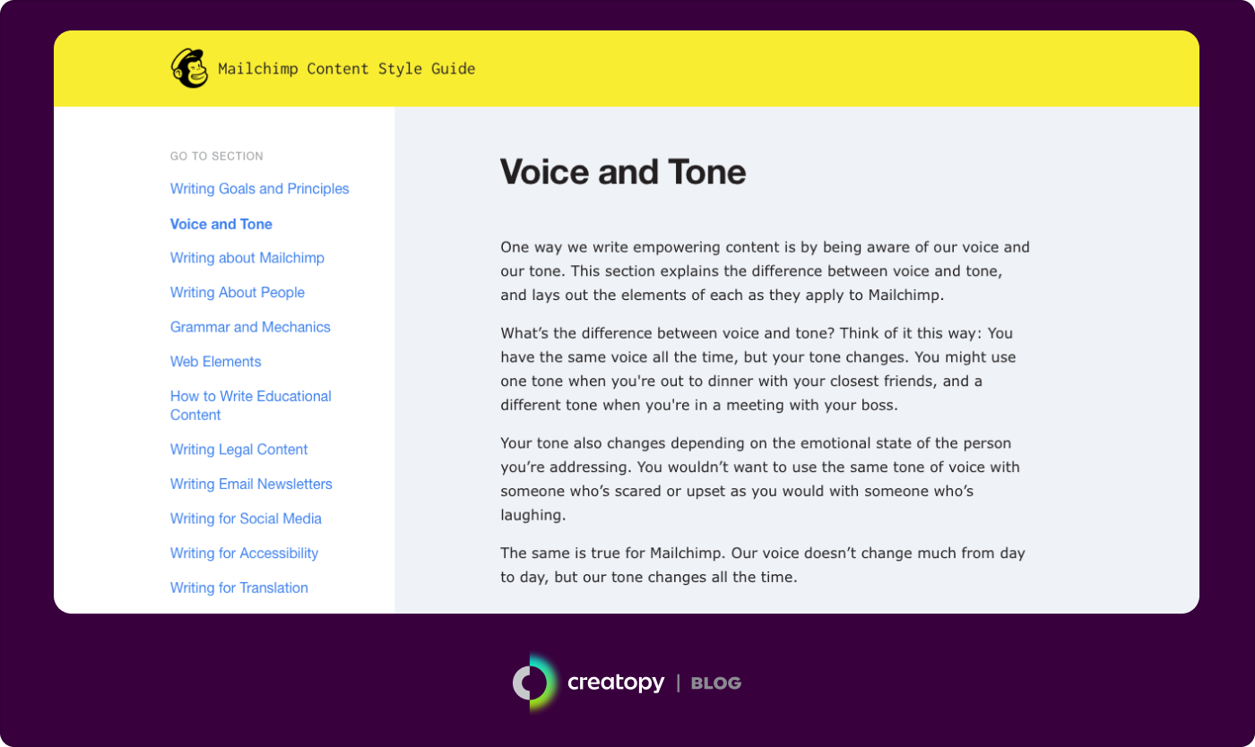
Real-world brand style guide example: Mailchimp
Mailchimp’s content style guide is a comprehensive and detailed document that explores the company’s tone and voice. It is an excellent blueprint to help inspire your own.
In its guidelines, Mailchimp’s traits include being plain-spoken and genuine with a dry sense of humor that breaks down complex topics into easy-to-understand knowledge. Their tone can be summarized as “usually informal, but it’s always more important to be clear than entertaining.”
Mailchimp’s brand style guide also covers its brand’s tone and voice in great detail—including grammar rules, style tips, and web elements—and discusses how it can best be applied to different aspects and scenarios.
3. Logo use
Your logo is a visual representation of your brand’s identity. Its purpose is to spark recognition, so it should be crafted to represent your brand accurately. Otherwise, you risk creating a divide between what your brand does and what it looks like it does, potentially deterring customers.
In this section of your branding style guide, you should communicate the ins and outs of your logo, including:
- Primary logo and variations
- Logo colors
- Logo sizing
- Logo placement
- Logo spacing
- Logo alignment
- Logo misuse cases
As we examine each of these, we’ll use Travel Portland’s brand style guide as a real-life example to show you how you can convey each of these aspects in your own style guidelines.
Primary logo and variations
Start by introducing your primary and secondary logos and their symbols, if necessary. Spend some time describing the logo and what it means to the brand. Break down the logo’s components and provide readers with context on how they came to be. You can also write about its history if it’s relevant to the current version.
![]()
![]()
Logo colors
You should also specify the colors you use for your logo and any alternate color combinations you may use. To keep the logo accurate across mediums, describe these colors using different color systems, such as Hex, RGB, CMYK, and Pantone. We’ll explore more details on color schemes later.
Logo sizing
The size of your logo matters—it’s what keeps your logo balanced and on-brand across materials. As such, you should indicate the proper proportions of your logo as well as the minimum size allowed. You can also choose to describe your logo dimensions in relation to other elements without mentioning a specific size.
![]()
![]()
Logo placement
You should also add placement guidelines for your logo, indicating where content creators and editors should display it in communication materials. Establish clear rules, such as consistently placing your logo at the top on the right-hand side of the first printed page or at the end of all corporate emails.
![]()
![]()
Logo spacing
Covering logo spacing is also a must. This detail makes the logo easier to spot if there are many elements on a visual. It also prevents it from being encroached upon by different components. You can use the height of the logo’s letter or icon as a reference to describe your logo’s spacing. For example, “Ensure at least 1X (one icon height) of clear space surrounding the logo icon on all.”
![]()
![]()
Logo alignment
How you align your logo across your visual assets also contributes to overall brand consistency. Clear and consistent logo alignment—whether vertical, horizontal, or diagonal—reinforces your brand’s identity and prevents logos from looking out of place or misaligned.
![]()
![]()
Logo misuse cases
Once you’ve covered the logo do’s, go over the don’ts. Logo misuse cases typically include incorrect colors, poor placement on top of unsuitable backgrounds, and the rotation, distortion, or alteration of the logo in any shape or form. You can convey your logo misuse cases with words or visual examples for better comprehension.
![]()
![]()
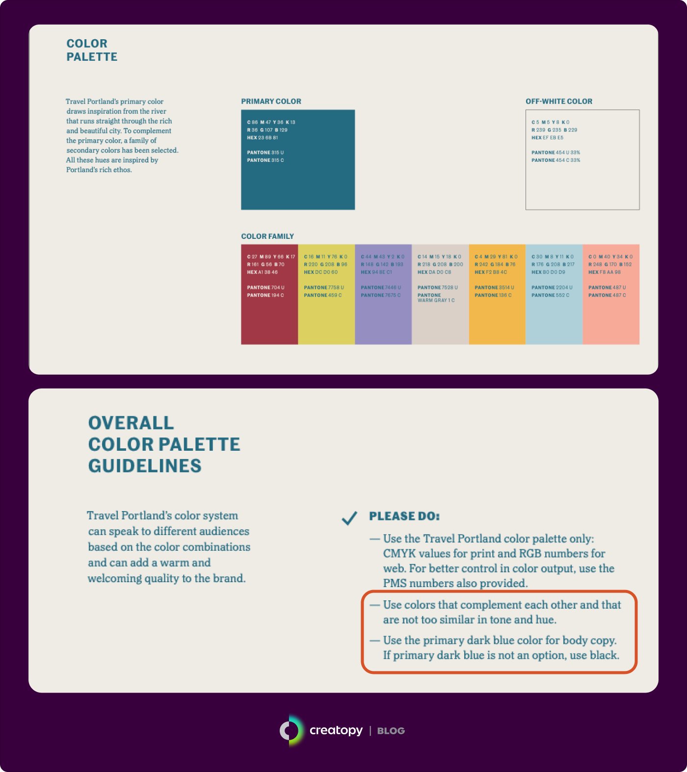
4. Color palette
Colors evoke strong emotions in people and even subconsciously convey information. This is why picking your brand color combinations shouldn’t be done carelessly. This decision requires careful consideration of color theory, potential cultural associations, and color psychology, which can drive or deter action.
Note that how you create your color palette is primarily up to you. There are no set rules about how many colors your brand should have. Some brands have a narrow palette of three or fewer colors, while others depend on secondary and tertiary color palettes to complete their brand image.
When describing your color palette in our branding style guide, show swatches of the brand colors and list the PMS, CMYK, RGB, and HEX color codes. Using these different color systems—some used for printing and others for screens and digital media—can keep your brand’s look consistent no matter where your audience sees you.
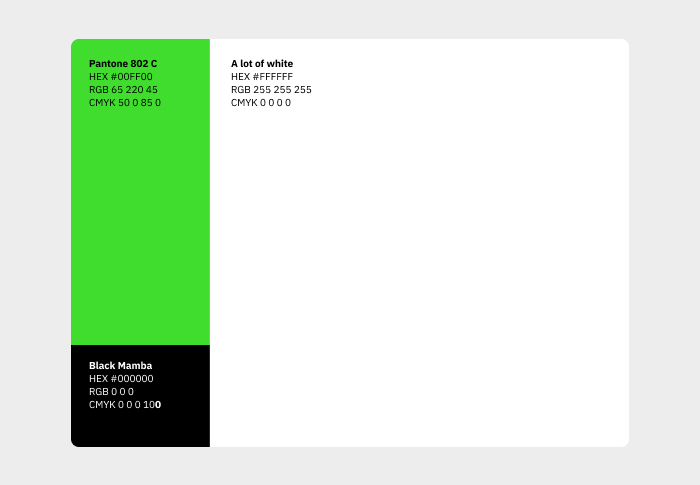
Real-world brand style guide example: Creatopy
For a look at how you can detail your color palette in your brand guidelines, let’s look at how we’ve done it at Creatopy, starting with Creatopy’s primary palette.
Creatopy’s primary color palette consists of three colors: neon green, black, and white, which are named Pantone 802 C, Black Mamba, and A lot of white. Combined, these colors give our brand a modern, clear, and dynamic look, with the neon green communicating our emphasis on innovation while giving our brand a pop of color.
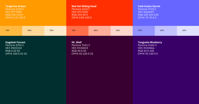
Our secondary color palette consists of six colors: three for layout elements and illustrations—Tangerine Dream, Red Hot Riding Hood, and Cold-fusion Secret—and three for backgrounds—Dagobah Forrest, Mr. Wolf, and Tunguska Blueberry. We also highlight the potential pairings between the two categories.
5. Imagery guidelines
The photos, videos, and illustrations you publish as part of your brand communications should reflect your brand. After all, a picture speaks a thousand words, and you want those words to resonate with your brand.
This is where the Pinterest board we mentioned is particularly handy. Using your Pinterest board can help you identify patterns and themes in your chosen images—such as lighting, color combinations, composition, and primary subject matter—and articulate these in words to clearly define your brand’s imagery style and align communications across mediums, platforms, and purposes.
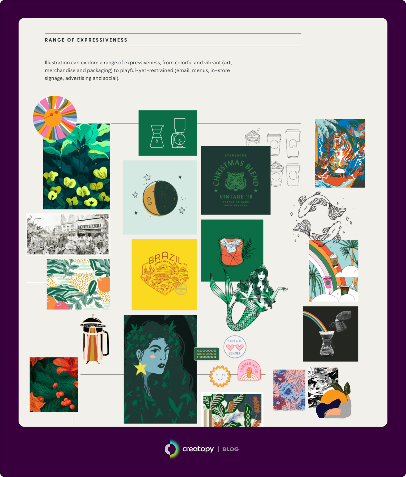
Real-world brand style guide example: Starbucks
Starbucks’ brand style guidelines cover their photography and illustration guidelines. Regarding their approach to photography, they explain, “Our photography is honest. Product is beautiful and believable. People are authentic, reliable.”
Their product photography guidelines include using a pint glass for cold beverages and a modern glass mug for hot beverages, incorporating graphic shadows, and highlighting details like cinnamon dustings and crema.
Their editorial photography can be divided into studio and environmental photography. Starbucks’ studio photography focuses on warm lighting that creates a soft yet realistic feel. Their environmental photography doubles down on this realness, including friendly faces and intriguing scenes that create an attainable and relatable experience.

Starbucks’ guidelines for illustrations are just as straightforward, albeit more flexible, stating that illustrations “can explore a range of expressiveness, from colorful and vibrant (art, merchandise and packaging) to playful-yet-restrained (email, menus, in-store signage, advertising and social).”
6. Typography
Next, dive into typography. The goal shouldn’t be to make your chosen typography your spotlight but to nest it into your brand’s look to create a harmonious brand identity. Beyond that, it should serve its most fundamental purpose: making your text readable for effective communication.
Finding the most suitable typography for your brand may require researching font psychology, different font categories, and applications of various weights and styles, such as bold or italic. Note that if you opt for multiple font styles, you must also consider how they pair and whether they complement each other.
After you’re satisfied with your chosen brand typography, describe each typeface and what makes it suitable for your brand. Make it practical by detailing the font categories—primary or secondary—and their different use cases. Detail information such as font sizes, hierarchy, weights, styles, spacing, colors, and pairings. All these pieces of information help creators within your company craft copy that’s on-brand.
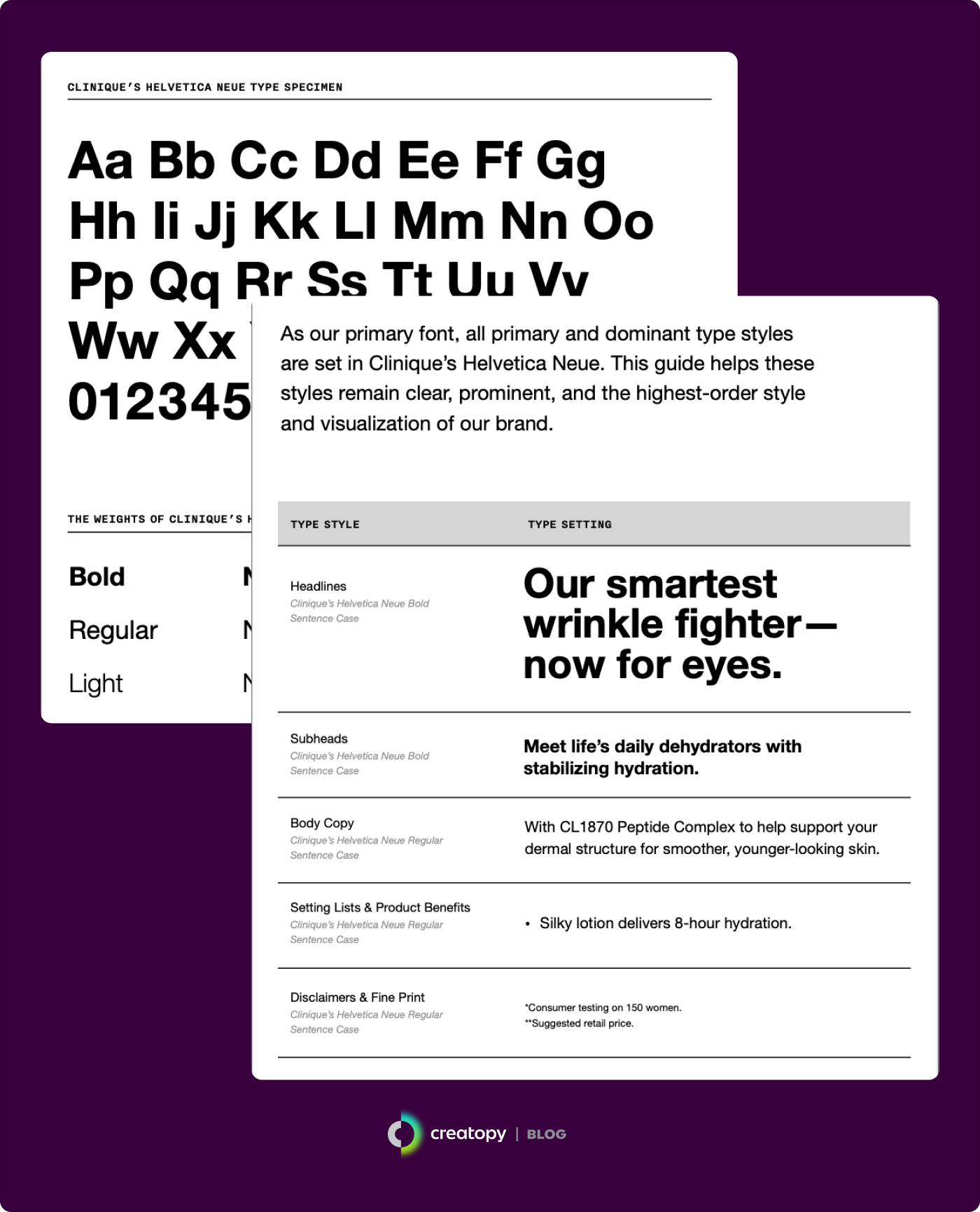
Real-world brand style guide example: Clinique
Clinique’s typography emphasizes clarity and boldness. It communicates with its audience using unique versions of Helvetica Neue and Nitti.
In its brand style guide, Clinique details how its Helvetica Neue typography should be used in headlines, copy, lists, and fine print, serving as “a guiding source of communication.” Its Nitti typography is a secondary typeface that drives “creative efficacy” and should be used for callouts, product names, claims, prices, and other pop-out elements.
For both of these fonts, Clinique goes into great detail about specifications, including case usage, letter spacing, font substitutions, type sizes, line spacing, and channel-specific type scales.
7. User interface elements
Your brand’s website can have dozens, if not hundreds, of pages, which your developers have to unify using your brand style guide. Part of that involves consistent user interface elements, which consist of visuals such as buttons, forms, menus, or icons. These typically appear on most—if not all—web pages of a brand’s website or application.
Describe each element’s specific look and design in your style guidelines to ensure accurate replication. This could involve information about their shape, style, size, accompanying typography, colors, spacing, and how users would interact with them.
Real-world brand style guide example: Waze
In 2020, Waze announced its brand refresh, which came with a new set of icons meant to emphasize community and expression. The company stated, “We weren’t interested in being a clean, minimal, ‘elevated’ tech brand because we’re not just about technology. We have the community with us.”
Their new icons burst with colors meant to reflect and represent drivers’ moods. They have since been adopted in-app and have become a distinctive, staple feature on their website.
![]()
![]()
8. Branded templates
You should also add often-used branded templates to your brand style guide. Coupled with the right design tools, branded design templates can be handy for keeping your visuals on-brand and consistent across all platforms.
In your brand guidelines, group design templates by category—such as internal, external, digital, or print templates—so creators can quickly sift through them. You can also add downloadable templates for specific use cases, such as social media campaigns, with additional dos and don’ts to instruct their usage.
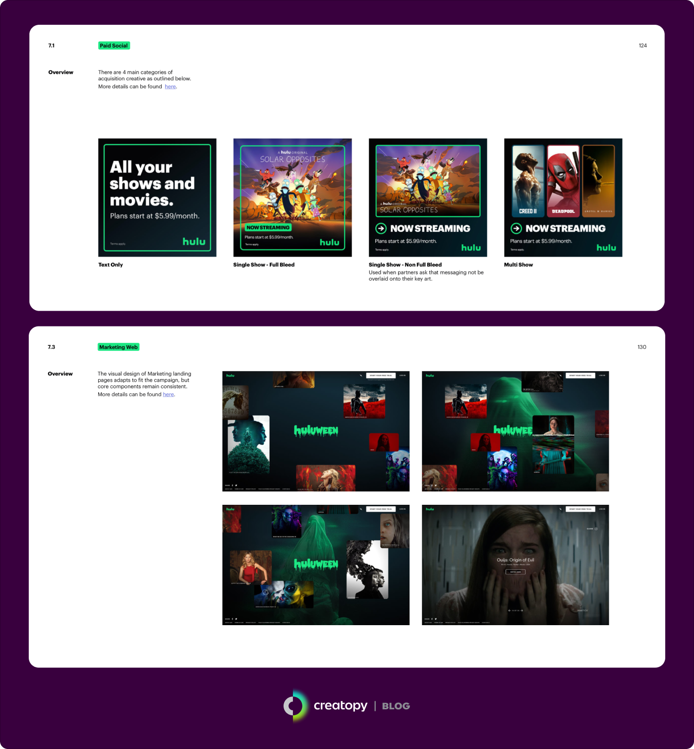
Real-world brand style guide example: Hulu
Hulu’s brand guidelines include a dedicated section for campaigns. This section showcases standard campaign designs for various platforms, essentially serving as templates. Content creators are instructed to use these designs as a starting point, adapting these according to the media channel on which they’ll be published.
Perfecting your brand style guide
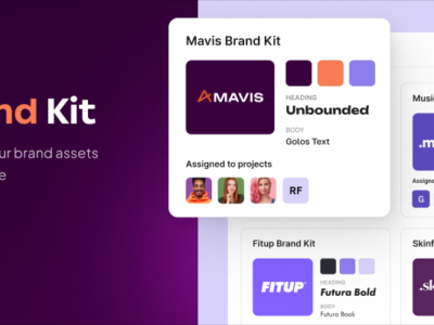
At the end of the day, it’s all about attracting and keeping customers. To do that, you need consistent communication, which starts with a strong brand style guide. Hopefully, the tips and insights above give you enough insight to help you tackle your own.
If you want to apply your brand look and feel to all your designs without the headache, rely on Creatopy’s Brand Kit feature to do the heavy lifting. Simply import the elements defined in your brand style guide—logos, color palettes, typography, and imagery—into Creatopy, and you’ll be ready to create on-brand visual assets in no time.